The ISTD, in association with Linotype asked for students to create a prestigious publication to celebrate the life and work of Swiss type designer Adrian Frutiger. The publication could be digital or print, had to appeal to a wide readership, and most importantly had to pay just homage to Frutiger himself.
Frutiger’s work is instrinsically linked to the International Typographic Style; his typefaces, certainly his sanserif typefaces exude this idea of clarity and legibility. The purpose of his typefaces was transparency. This idea of a lifetime of work and practice, resulting in typefaces that to the uninformed would seem like nothing more than simple letters: I found both gloriously poetic, and rather sad. It seemed only right to highlight everything that has gone unnoticed.
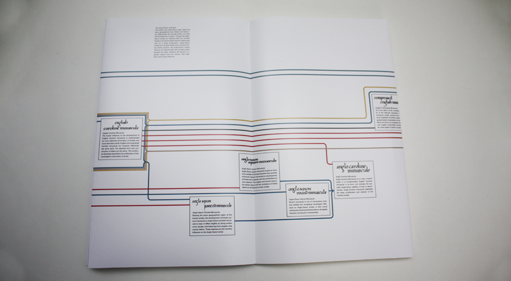
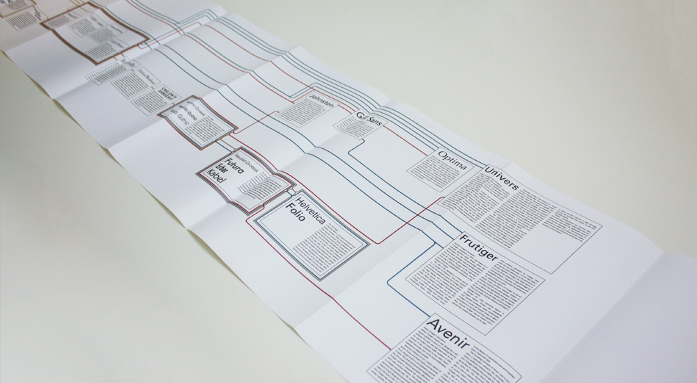
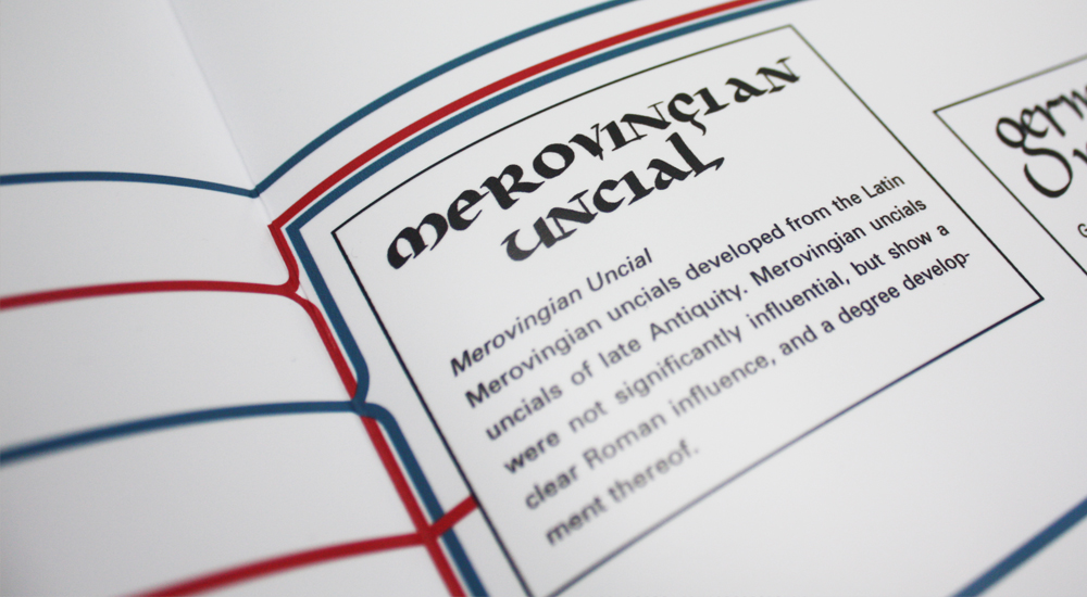
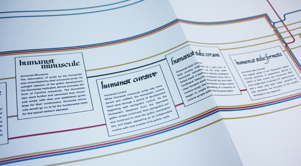
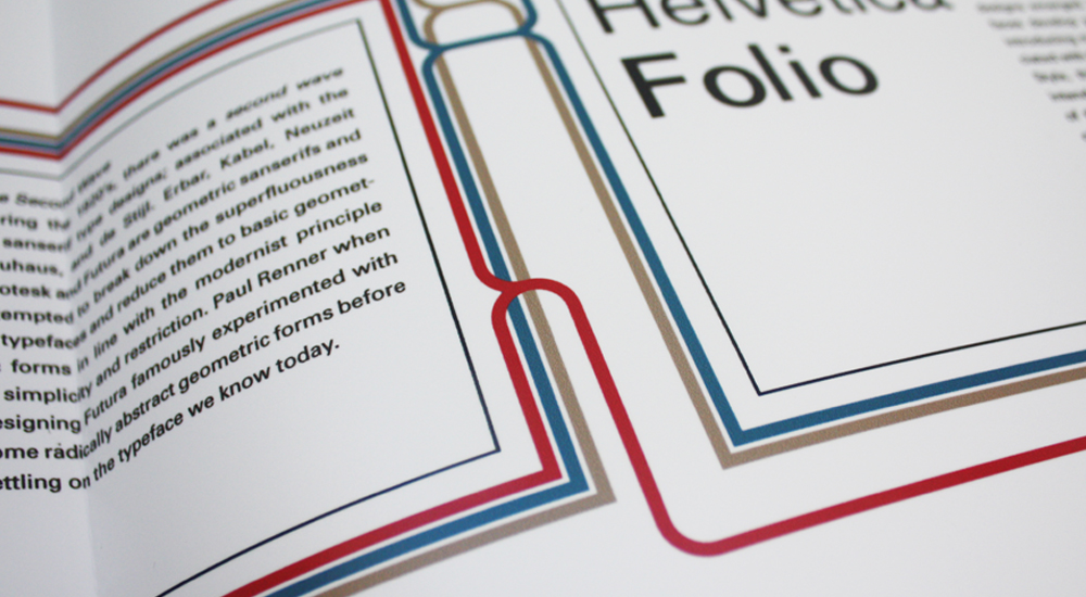
My publication is a timeline, covering the development of western scripts, from Roman Antiquity through the advent of the printing press, and the subsequent development of typefaces, reaching a final crescendo with Univers, Frutiger and Avenir. The examples are tied together with a network of connections detailing developments. The examples are also annotated with further verbal details. The timeline represents Frutiger’s education as a historian of script, and his skill as a calligrapher. It is visualisation of the idea that Frutiger’s work is a product of a wealth of knowledge and history.